Return

Spabo

A grid was designed as the foundation for laying out all elements that make up the Spabo brand. Putting each letter and shape on its [optical] right place. Note that strictly following the grid in some cases may not work as expected. Different shapes can optically look mispositioned and throw the whole composition off balance.
Don’t let the simplicity fool you. Spabo business cards were made on the same proportions as its brand. Effectively turning every card into a coloured logo. 4 colour options were made available.
Spabo own and develop properties with character and charm that few businesses [if any] can match. Part of designing the identity was to produce pictures that showcased these features in their own unique way.
The grid is used throughout the brand assets. Building a coherent language that comunicates simplicity and elegance without being pretentious.

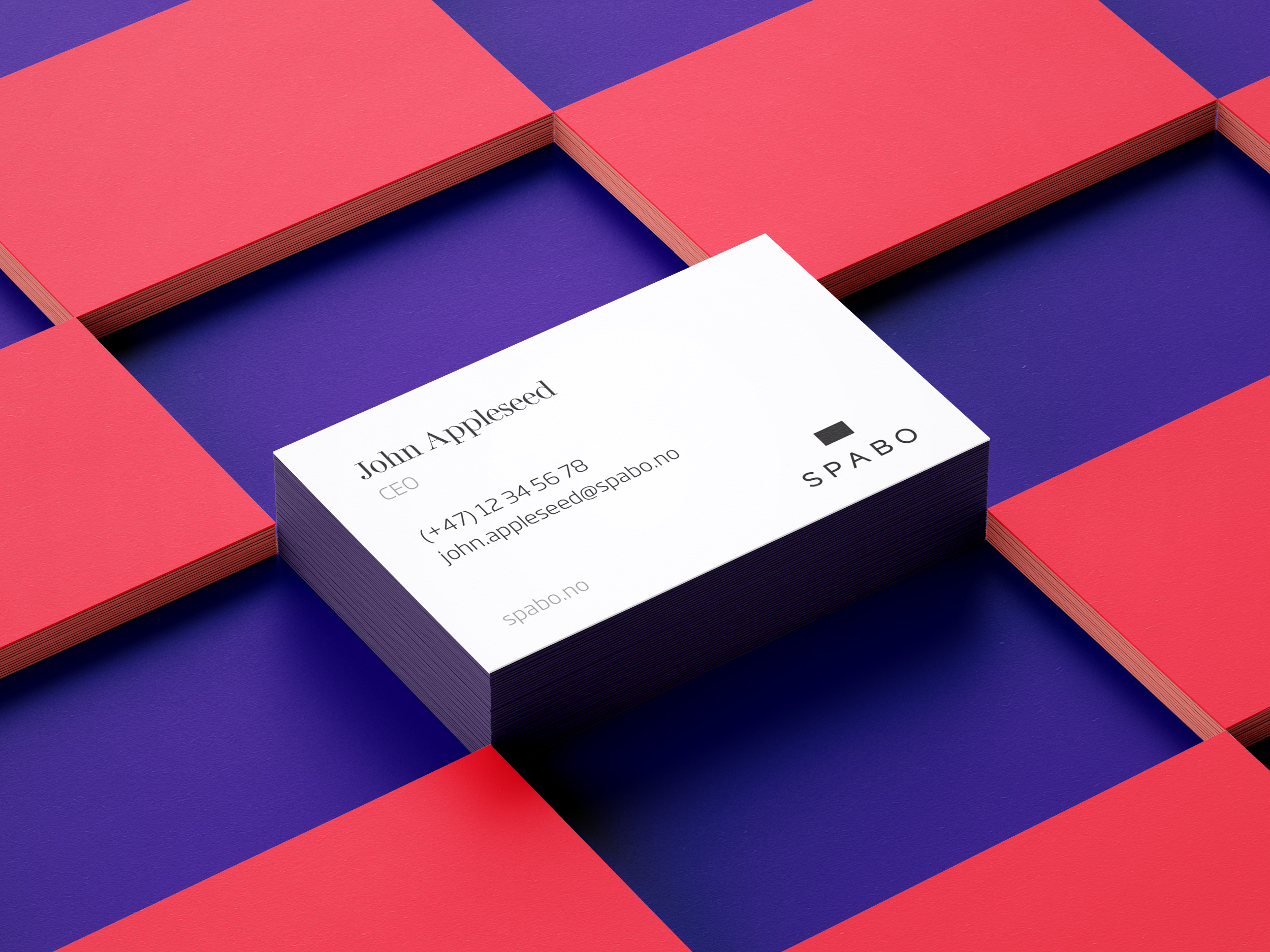
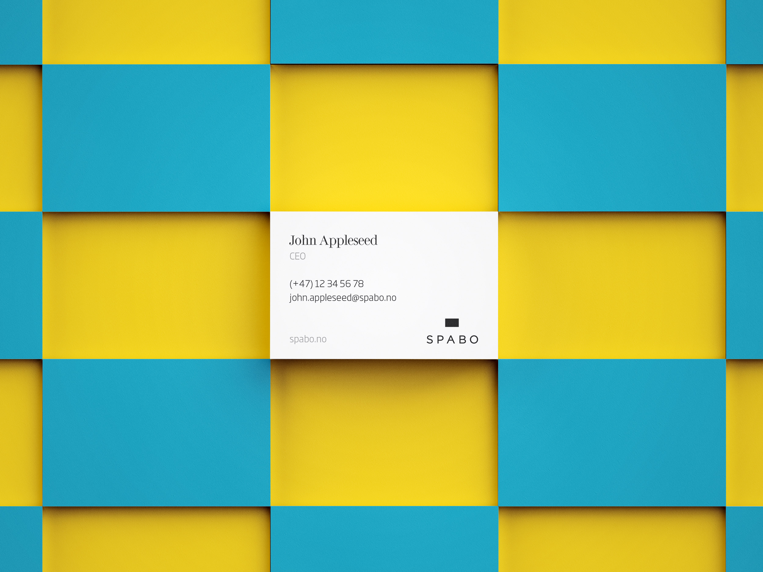
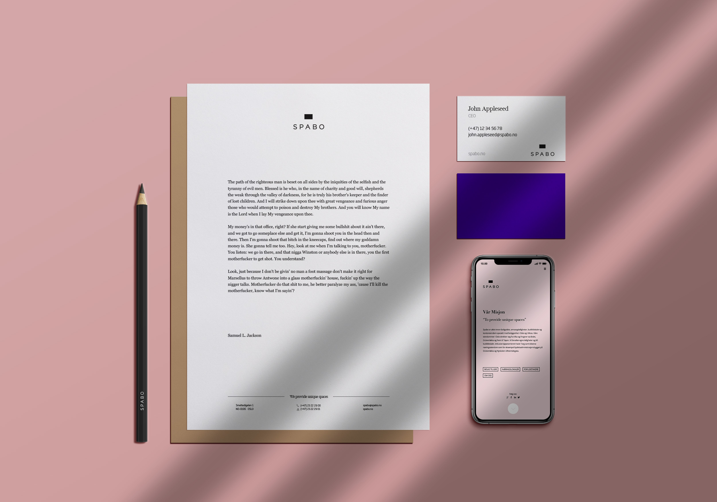
Spabo & Spabogruppen

Spabo is a family owned business specialised in creating and leasing real estate that have unique attributes. They are part of Spabogruppen which is owned by the Spandow family. Spabogruppen had revenues of about 1.2 B NOK in 2020.

The identity has been created in 2013 and has proven timeless. Included in building a new identity was the task of designing a new website (now replaced) and approprietated stationary.

P.S.: This project was undertaken not by Atropical AS. It’s part of Felipe Hefler’s personal portfolio.

2026 © Atropical AS, Org.№ 926 176 390 MVA